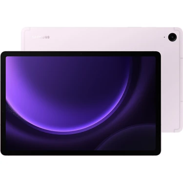
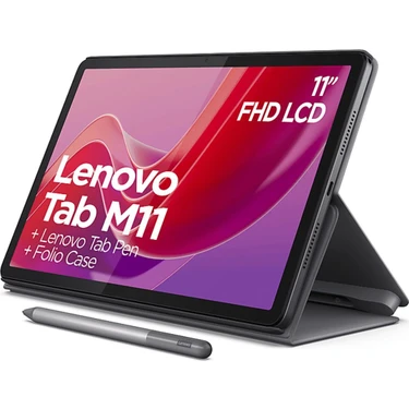
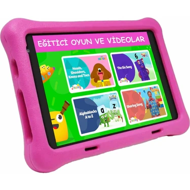
Benzer Ürünler

Satıcıdan aynı kategoride diğer ürünler
Tümü


Ürün bilgileri
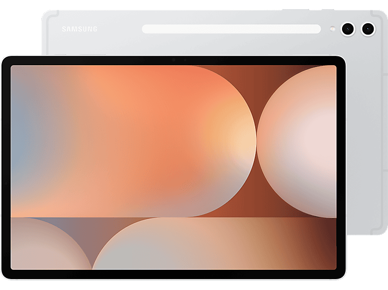
body { margin: 0; } .clear { clear: both; } .desktop-only { display: block; } .mobile-only { display: none; } .partner-static * { box-sizing: border-box; } .partner-static :focus { outline: none; } .partner-static { width: 100%; margin: 0; padding: 0; text-align: left; font-family: 'SamsungOne'; } .partner-static .bg-white { background-color: #ffffff; } .partner-static .bg-gray { background-color: #f5f5f5; } .partner-static .bg-black { background-color: #000000; } .partner-static h2.title-lg { font-family: 'SamsungSharpSans'; font-size: 76px; line-height: 1.25; margin: 0 0 40px 0; color: #000000;} .partner-static h2 { font-family: 'SamsungSharpSans'; font-size: 48px; line-height: 1.25; margin: 30px 0 30px 0; color: #000000;} .partner-static h3 { font-family: 'SamsungSharpSans'; font-size: 36px; line-height: 1.25; margin: 0 0 20px 0; color: #000000; } .partner-static h4 { font-family: 'SamsungOne'; font-size: 24px; line-height: 1.25; margin: 0 0 20px 0; color: #000000; } .partner-static h5 { font-family: 'SamsungSharpSans'; font-size: 20px; line-height: 1.25; margin: 0 0 10px 0; color: #000000; } .partner-static p { font-family: 'SamsungOne'; font-size: 18px; line-height: 1.33; margin: 0 0 5px; color: #000000;} .partner-static .title-sm { font-family: 'SamsungOne'; font-size: 20px; line-height: 1; margin: 0 0 10px 0; letter-spacing: 1.2; color: #767676; } .partner-static p.text-sm { font-size: 17px; line-height: 1.4; } .partner-static p.sm-gray { font-size: 14px; line-height: 1.4; color: #767676; } .partner-static .text-white { color: #ffffff; } .partner-static .text-gray { color: #a6a6a6; } .partner-static p strong { font-weight: 700; color: #000; } .partner-static h2 sup { font-size: 60%; line-height: 1; } .partner-static p sup { font-size: 70%; line-height: 1; } .partner-static .img-wrapper { text-align: center; } .partner-static .img-wrapper img { max-width: 100%; margin-left: auto; margin-right: auto; } .partner-static .icon-wrapper img { max-width: 100%; max-height: 100%; } .partner-static .video-wrapper { width: 100%; margin: 0; padding: 0; position: relative; padding-bottom: 56.25%; overflow:hidden; } .partner-static .video-wrapper video, .partner-static .video-wrapper iframe { position: absolute; top: 0; left: 0; width: 100%; height: 100%; } .partner-static .text-center { text-align: center; } .partner-static .text-left { text-align: left; } .partner-static .width-50 { width: 50%; text-align: center; margin: auto; } .partner-static .width-60 { width: 60%; text-align: center; margin: auto; } .partner-static .width-100 { width: 100%;} .partner-static .no-ptop { padding-top: 0 !important; } .partner-static .no-pbottom { padding-bottom: 0 !important; } .partner-static a { color: #000; text-decoration: none; } .partner-static { width: 100%; margin: 0; padding: 0; } .partner-static-inner { width: 100%; max-width: 1440px; margin: 0 auto; padding: 0; } .partner-main-container { width: 100%; margin: 0; padding: 0; } .ps-header-item { width: 100%; margin: 0; padding: 20px 0; } .ps-section-item { width: 100%; margin: 0; padding: 0; } .ps-container { width: 100%; margin: 0; padding: 0; } .ps-disclaimers { max-width: 1200px; width: 100%; margin: 0 auto; padding: 40px 0; } .ps-disclaimers ul { list-style: outside none none; margin: 0; padding: 0; } .ps-disclaimers ul li { font-family: 'SamsungOne'; font-size: 13px; list-style-type: none !important; padding: 0 5px; margin-left: 26px; } .ps-py-xl { padding-top: 150px; padding-bottom: 150px; } .ps-py-lg { padding-top: 80px; padding-bottom: 80px; } .ps-py-md { padding-top: 40px; padding-bottom: 40px; } .ps-py-sm { padding-top: 20px; padding-bottom: 20px; } .ps-pt-xl { padding-top: 150px; } .ps-pt-lg { padding-top: 80px; } .ps-pt-md { padding-top: 40px; } .ps-pt-sm { padding-top: 20px; } .ps-pb-lg { padding-bottom: 80px; } .ps-pb-md { padding-bottom: 40px; } .ps-pb-sm { padding-bottom: 20px; } .ps-pl-lg { padding-left: 80px; } @media (min-width:768px) and (max-width: 1440px) { .partner-static h2 { font-size: 3.33333vw; margin: 0 0 2.08333vw; } .partner-static h2.title-lg { font-size: 5.277777778vw; margin: 0 0 2.777777778vw 0; } .partner-static h3 { font-size: 2.5vw; margin: 0 0 1.388888889vw 0; } .partner-static h4 { font-size: 1.666667vw; margin: 0 0 1.38889vw 0; } .partner-static h5 { font-size: 1.38889vw; margin: 0 0 0.69444vw 0; } .partner-static p { font-size: 1.25vw; margin: 0 0 0.347222vw; } .partner-static .title-sm { font-size: 1.38889vw; margin: 0 0 0.69444vw 0; } .partner-static p.text-sm { font-size: 1.18056vw; } .partner-static p.sm-gray { font-size: 0.97222vw; } .ps-header-item { padding: 1.38889vw 0; } .ps-section-item { padding: 0; } .ps-disclaimers { padding: 2.77778vw 0; } .ps-disclaimers ul li { font-size: 0.902778vw; padding: 0 0.347222vw; margin-left: 1.805556vw; } .partner-static .width-50 { width: 40.55555556vw; } .partner-static .width-60 { width: 61.166666667vw; } .ps-py-xl { padding-top: 10.41666667vw; padding-bottom: 10.41666667vw; } .ps-py-lg { padding-top: 5.556vw; padding-bottom: 5.556vw; } .ps-py-md { padding-top: 2.777777778vw; padding-bottom: 2.777777778vw; } .ps-py-sm { padding-top: 1.388888889vw; padding-bottom: 1.388888889vw; } .ps-pt-xl { padding-top: 10.41666667vw; } .ps-pt-lg { padding-top: 5.556vw; } .ps-pt-md { padding-top: 2.777777778vw; } .ps-pt-sm { padding-top: 1.388888889vw; } .ps-pb-lg { padding-bottom: 5.556vw; } .ps-pb-md { padding-bottom: 2.777777778vw; } .ps-pb-sm { padding-bottom: 1.388888889vw; } .ps-pl-lg { padding-left: 5.556vw; } } @media (min-width: 768px) and (max-width: 1024px) { .partner-static .width-60 { width: 81.166667vw; } } @media (max-width: 767px) { .desktop-only { display: none; } .mobile-only { display: block; } .partner-static h2 { font-size: 8.33333333vw; margin: 0 0 5.555556vw 0; } .partner-static h3 { font-size: 8.222222222vw; margin: 0 0 4.166667vw 0; } .partner-static h2.title-lg { font-size: 10.55555556vw; margin: 0 0 5.555555556vw 0; } .partner-static h4 { font-size: 5vw; margin: 0 0 4.166667vw 0; } .partner-static h5 { font-size: 4.166667vw; margin: 0 0 2.77778vw 0; } .partner-static p { font-size: 3.61111vw; margin: 0 0 1.388888889vw 0; } .partner-static .title-sm { font-size: 4.166667vw; margin: 0 0 10px 0; } .partner-static p.text-sm { font-size: 4.027778vw; } .partner-static p.sm-gray { font-size: 3.888889vw; } .ps-disclaimers ul { list-style: outside none none; } .ps-disclaimers ul li { font-size: 3.055555556vw; margin-left: 6.944444444vw; } .ps-header-item { padding: 2.777777778vw 0; } .partner-static .width-50 { width: 100%; } .partner-static .width-60 { width: 100%; } .ps-py-xl { padding-top: 10.43vw; padding-bottom: 10.43vw; } .ps-py-lg { padding-top: 10.43vw; padding-bottom: 10.43vw; } .ps-py-md { padding-top: 5.555555556vw; padding-bottom: 5.555555556vw; } .ps-py-sm { padding-top: 2.777777778vw; padding-bottom: 2.777777778vw; } .ps-pt-xl { padding-top: 10.43vw; } .ps-pt-lg { padding-top: 10.43vw; } .ps-pt-md { padding-top: 5.555555556vw; } .ps-pt-sm { padding-top: 2.777777778vw; } .ps-pb-lg { padding-bottom: 10.43vw; } .ps-pb-md { padding-bottom: 5.555555556vw; } .ps-pb-sm { padding-bottom: 2.777777778vw; } .ps-pl-lg { padding-left: 10.43vw; } } /* Component: Logo Header */ .ps-header-item .logo-wrapper { padding: 0 50px; } .ps-header-item .logo-wrapper .img-wrapper { text-align: left; } /* Component: Product Summary */ .summary-list-wrapper { width: 100%; margin: 0; padding: 48px 24px; background-color: #ffffff; } .summary-list { width: 100%; margin: 0; padding: 0; text-align: center; } .summary-item { display: inline-block; width: 24.5%; position: relative; color: #fff; text-align: center; vertical-align: middle; border-right: 1px solid #cccccc; } .summary-item:last-child { border-right: none; } .summary-item-icon { display: inline-block; position: relative; width: 100%; font-size: 0; } .summary-item-icon .img-wrapper img { max-width: 60px; max-height: 60px; } .summary-item-text { display: table; color: #000; text-align: center; overflow: hidden; width: 100%; height: 38px; margin-top: 16px; } .summary-item-text span { display: table-cell; vertical-align: middle; padding: 0 12px; height: 38px; font-family: 'SamsungOne',arial,sans-serif; font-weight: 400; font-size: 14px; line-height: 1.33; overflow: hidden; word-break: break-word; } /* Component: Top Features */ .feature-container { display: inline-block; position: relative; width: 100%; font-size: 0; } .feature-container .feature-inner { display: flex; justify-content: center; } .feature-container .feature-item { padding: 20px 40px 20px 20px; display: flex; background: rgba(0,0,0,0.1); border: 1px solid rgba(0,0,0,0.26); color: #000; margin-right: 1.66666667vw; border-radius: 1.38888889vw; width: 23%; } .feature-container .feature-item-inner { display: flex; align-items: center; justify-content: center; } .feature-container .feature-item:last-child { margin-right: 0; } .feature-container .feature-icon-wrapper img { width: 80px; height: 80px; max-width: 100%; max-height: 100%; } .feature-container .feature-icon-wrapper { flex-basis: 25%; } .feature-container .feature-txt-wrapper { padding: 0 0 0 20px; flex-basis: 75%; } .feature-container .feature-title p { font-family: 'SamsungOne',arial,sans-serif; font-size: 22px; line-height: 1.33; font-weight: bold; margin: 0 0 16px 0; } .feature-container .feature-desc p { font-family: "SamsungOne", arial, sans-serif; font-size: 14px; line-height: 1.33; } .feature-container .feature-main-title { text-align: center; width: 100%; padding: 10px 0; } /* Component: Full Bleed Feature */ .feature-benefit-wrapper { padding: 80px 88px 60px; text-align: center; } .feature-benefit-text { padding: 0 0 60px; } .feature-benefit-disclaimer { width: 88%; margin: 0 auto; padding: 32px 0 0; } .feature-benefit-disclaimer p { color: #313131; font-size: 12px; text-align: center; word-wrap: break-word; } .feature-benefit-text.bg-black { padding: 60px 0; } .feature-benefit-wrapper.full-bleed { padding: 80px 0px 80px; } .feature-benefit-wrapper.full-bleed.nightography-section { padding: 20px 0px 0; } .feature-benefit-wrapper.full-bleed.video-section { padding-bottom: 0; } .feature-benefit-wrapper.full-bleed.camera-section { padding-bottom: 0; } .feature-benefit-wrapper.full-bleed .feature-benefit-text { padding: 0 88px 60px; } /* Component: Feature Gallery */ .feature-gallery-wrapper { padding: 80px 88px 60px; text-align: center; } .feature-gallery-title { padding: 0 0 60px; } .feature-gallery-items { width: 100%; display: -webkit-box; display: -ms-flexbox; display: flex; -webkit-box-pack: center; -ms-flex-pack: center; justify-content: center; -webkit-box-orient: horizontal; -webkit-box-direction: normal; -ms-flex-direction: row; flex-direction: row; -ms-flex-wrap: wrap; flex-wrap: wrap; font-size: 0; -webkit-box-sizing: border-box; box-sizing: border-box; align-items: center; justify-content: space-around; } .feature-gallery-item-inner { padding: 0; } .feature-gallery-item { width: 50%; display: inline-block; -webkit-box-sizing: border-box; box-sizing: border-box; margin: 0; font-size: 0; } .feature-gallery-disclaimer { width: 88%; margin: 0 auto; padding: 32px 0 0; } .feature-gallery-disclaimer p { color: #313131; font-size: 12px; text-align: center; word-wrap: break-word; } .feature-gallery-wrapper.eraser-section { padding-bottom: 0; } .feature-gallery-wrapper.remaster-section { padding-bottom: 0; } .feature-gallery-wrapper.two-gallery-item { text-align: left; padding-top: 0; padding-bottom: 0; } .two-gallery-item .feature-gallery-items { align-items: flex-start; } .two-gallery-item .feature-gallery-item-inner { padding: 0 20px; } .two-gallery-item .feature-gallery-item .feature-gallery-desc { padding: 30px 10px 50px; } .two-gallery-item .feature-gallery-title { text-align: center; padding: 0 0 30px 0; } .two-gallery-item img { border-radius: 20px; } .two-gallery-item .gallery-desc { height: 100px; } .two-gallery-item .gallery-title h3 { font-size: 30px; } .two-gallery-item .gallery-subtitle { padding: 0 0 10px 0; } .two-gallery-item .gallery-subtitle p { font-size: 20px; } .two-gallery-item .feature-gallery-disclaimer { width: 100%; } .two-gallery-item .feature-gallery-disclaimer p { text-align: left; } .feature-gallery-wrapper.three-gallery-item { width: 100%; padding: 50px 0 20px; text-align: left; } .three-gallery-item .feature-gallery-items { display: inline-block; width: 100%; } .three-gallery-item .feature-gallery-item { display: inline-block; width: 33.33%; vertical-align: top; } .three-gallery-item .feature-gallery-item-inner { padding: 0 20px; } .three-gallery-item .feature-gallery-item .feature-gallery-desc { padding: 30px 10px 0px; } .three-gallery-item .feature-gallery-title { text-align: center; padding: 0 0 30px 0; } .three-gallery-item img { border-radius: 20px; } .three-gallery-item .gallery-subtitle { padding: 0 0 10px 0; } .three-gallery-item .gallery-subtitle p { font-size: 20px; } .three-gallery-item .gallery-desc { height: 100px; } .three-gallery-item .feature-gallery-desc h3 { font-size: 28px; padding: 0; } .three-gallery-item .feature-gallery-wrapper img { border-radius: 20px 20px 0 0; } .three-gallery-item .feature-gallery-disclaimer { width: 100%; margin: 0 auto; padding: 32px 10px 0; } .three-gallery-item .feature-gallery-disclaimer p { color: #313131; font-size: 12px; text-align: left; word-wrap: break-word; } .experience-section .three-gallery-item .feature-gallery-item-inner { padding: 30px 20px; } .experience-section .feature-gallery-wrapper { width: 100%; padding: 50px 0 20px; text-align: left; } .experience-section .feature-gallery-items { display: inline-block; width: 100%; } .experience-section .feature-gallery-item { display: inline-block; width: 33%; vertical-align: top; } .experience-section .feature-gallery-text { padding: 0; text-align: center; padding: 0 0 30px 0; } .experience-section .feature-gallery-desc { padding: 38px 30px; } .experience-section .feature-gallery-desc h3 { font-size: 24px; padding: 0; } .experience-section .feature-gallery-desc p { font-size: 14px; padding: 0; } .experience-section .feature-gallery-wrapper img { border-radius: 20px 20px 0 0; } .experience-section .feature-gallery-disclaimer { width: 100%; margin: 0 auto; padding: 32px 0 0; } .experience-section .feature-gallery-disclaimer p { color: #313131; font-size: 12px; text-align: center; word-wrap: break-word; } .inactive-feature { border: 1px solid #000; display: inline-flex; padding: 10px 20px; border-radius: 25px; } .active-feature { border: 1px solid #000; background-color: #000; display: inline-flex; padding: 10px 20px; border-radius: 25px; } .inactive-feature p { margin: 0; } .active-feature p { color: #fff !important; margin: 0; } /* Component: Feature Story Text Image */ .feature-story-telling { width: 100%; display: -webkit-box; display: -ms-flexbox; display: flex; -webkit-box-pack: center; -ms-flex-pack: center; justify-content: center; -webkit-box-orient: horizontal; -webkit-box-direction: normal; -ms-flex-direction: row; flex-direction: row; -ms-flex-wrap: wrap; flex-wrap: wrap; font-size: 0; -webkit-box-sizing: border-box; box-sizing: border-box; align-items: center; } .feature-story-telling.cmp-reverse { -ms-flex-direction: row-reverse; flex-direction: row-reverse; } .feature-story-telling-col { width: 50%; display: inline-block; -webkit-box-sizing: border-box; box-sizing: border-box; margin: 0; font-size: 0; } .feature-story-telling-text { padding: 80px 48px 80px 88px; } .feature-story-telling.cmp-reverse .feature-story-telling-text { padding: 80px 88px 80px 48px; } .feature-story-disclaimer-wrap { display: block; padding: 32px 0 0; margin: 0 auto; width: 100%; } .feature-story-disclaimer-wrap p { color: #313131; font-size: 12px; word-wrap: break-word; } .mob-disclaimer { display: none; } /* Component: Feature Overlay */ .cmp-feature-overlay { width: 100%; margin: 0; padding: 0; position: relative; } .cmp-feature-overlay-bg { width: 100%; margin: 0; padding: 0; } .cmp-feature-overlay-content { position: absolute; z-index: 1; width: 45%; top: 10%; left: 5%; } .cmp-feature-overlay-title, .cmp-feature-overlay-desc { padding: 0 20px; } .cmp-feature-overlay-content.kv-overlay { width: 100%; top: 12%; left: auto; text-align: center; } .cmp-feature-overlay-content.camera-feature-overlay { width: 50%; top: 4%; left: 5%; text-align: left; } .cmp-feature-overlay-content.ois-feature-overlay { width: 35%; top: 10%; left: 5%; text-align: left; } .cmp-feature-overlay-disclaimer { display: block; padding: 32px 20px; margin: 0 auto; width: 100%;} .cmp-feature-overlay-disclaimer p { color: #313131; font-size: 12px; word-wrap: break-word; } /* Component: Topic Intro - Section Title */ .cmp-model-intro-wrapper { width: 100%; max-width: 1000px; margin: 0 auto; padding: 0; text-align: center; } .cmp-model-intro h2 { width: 100%; margin: auto; } .feature-gallery-items-modified {row-gap: 30px;column-gap: 30px;justify-content: center !important;} .feature-gallery-item-modified{ width: 40% !important;} .feature-benefit-text-modified-7 {background-color: #000;color: white !important; padding-top: 40px !important;} .feature-benefit-text-modified-7 h2,.feature-benefit-text-modified-7 p{color: white !important;margin-bottom: 1.11vw;} .feature-benefit-wrapper-modified-7{padding: 0 !important;} .cmp-feature-overlay-content-modified-7 h2, .cmp-feature-overlay-content-modified-7 p{color: white !important;} .feature-gallery-item-modified-14{width: 50% !important;} .cmp-model-intro-wrapper-modified-13{text-align: left !important;margin: 0 !important;padding-left: 28.8px !important;} .disclaimer-modified-padding-bottom{padding-bottom:79.2px !important;} .inactive-feature-modified{margin-top: 57.6px;} .cmp-feature-overlay-content-modified{width: 50% !important; left: 28% !important;} .bg-modified-grey{background-color: rgb(247, 247, 247) !important;} .specification{text-align: center; margin-top: 115.2px !important;} .specification-card-wrapper{display: flex;align-items: center; justify-content: center;text-align: center;column-gap: 150px;} .specification-details-wrapper{display: flex;justify-content: center;flex-direction: column;margin-top: 10vw;background-color: rgb(247, 247, 247);padding-bottom: 86.4px;} .specification-details-card{display: flex;justify-content: space-between;text-align: left;max-width: 100%;padding: 72px; border-bottom: 1px solid rgb(194, 194, 194);} .specification-details-card-header{width: 33.33%;} .specification-details-card-body{width: 33.33%;padding-right: 14.4px;padding-left: 14.4px;} .specification-details-card-body-sub{margin-top: 57.6px;} .--util--row-reverse{flex-direction: row-reverse !important;} .--util-mtop-m{margin-top: 86.4px !important;} .--util-text-white{color: white !important;} .--util-text-white h2{color: white !important;} .--util-text-white p{color: white !important;} .--no-margin{margin: 0 !important;} .icons-design-img-container{align-items: center;display: flex;justify-content: center;} .icons-design-img-container .img-wrapper{width: 95%;} .color-img-container{display: flex;} .color-img-container .img-wrapper{padding: 0 20px;} .color-option{display: flex;flex-direction: column;align-items: center;justify-content: center;} .color-option .img-wrapper{margin-bottom: 20px;} .color-option .img-wrapper img{width: 60%;} .color-option-wrapper{display: flex;flex-direction: column;margin-left: 50%;transform: translate(-40%,0);margin-top: 20px;row-gap: 10px;justify-content: center;} .color-option-inner{display: flex;column-gap: 10px;} .moonstone-gray{width: 15px;height: 15px;background-color: rgb(96, 110, 129);border-radius: 100%;} .plat-silver{width: 15px;height: 15px;background-color: rgb(218, 214, 202);border-radius: 100%;} .graphite{width: 15px;height: 15px;background-color: rgb(83, 82, 86);border-radius: 100%;} .beige{width: 15px;height: 15px;background-color: rgb(206, 192, 159);border-radius: 100%;} .fe-gray{width: 15px;height: 15px;background-color: rgb(128, 128, 128);border-radius: 100%;} .silver {width: 15px;height: 15px;background-color: rgb(192, 192, 192);border-radius: 100%;} .mint {width: 15px;height: 15px;background-color: rgb(193, 209, 166);border-radius: 100%;} .lavender{width: 15px;height: 15px;background-color: rgb(220, 206, 218);border-radius: 100%;} .note-assist-wrapper{display: flex;flex-wrap: wrap;align-items: center;justify-content: center;} .note-assist-wrapper .feature-benefit-wrapper{flex-basis: 50%;} .feature-story-disclaimer-wrap p {color: #313131 !important;} .feature-gallery-disclaimer p {color: #313131 !important;} .bg-black .feature-story-disclaimer-wrap p {color: #a6a6a6 !important;} .bg-black .feature-gallery-disclaimer p {color: #a6a6a6 !important;} .note-assist-wrapper .feature-benefit-wrapper{padding: 40px 40px;} @media (min-width: 768px) and (max-width: 1440px) { .ps-header-item .logo-wrapper { padding: 0 3.472222222vw; } .summary-list-wrapper { padding: 3.33333vw 1.666667vw; } .summary-item-icon .img-wrapper img { max-width: 4.16667vw; max-height: 4.16667vw; } .summary-item-text { height: 26px; padding: 0vw .83333333vw; font-size: .97222222vw; } .summary-item-text span { height: 26px; padding: 0vw .83333333vw; font-size: .97222222vw; } /* Component: Top Features */ .feature-container .feature-item { padding: 1.25vw 1.388888889vw 1.25vw 1.25vw; margin-right: 1.66666667vw; border-radius: 1.38888889vw; width: 23%; } .feature-container .feature-txt-wrapper { padding: 0 0 0 1.388888889vw; } .feature-container .feature-title p { font-size: 1.527777778vw; margin: 0 0 1.111111111vw 0; } .feature-container .feature-desc p { font-size: 0.972222222vw; } .feature-container .feature-main-title { padding: 2.777777778vw 0 0.694444444vw 0; } .feature-container .feature-icon-wrapper img { width: 5.555555556vw; height: 5.555555556vw; } .feature-benefit-wrapper { padding: 5.55556vw 6.111111vw 4.16667vw; } .feature-benefit-text { padding: 0 0 4.16667vw; } .feature-benefit-disclaimer { padding: 2.222222vw 0 0; } .feature-benefit-disclaimer p { font-size: 0.833333vw; } .feature-benefit-wrapper.full-bleed { padding: 5.555555556vw 0 5.555555556vw;} .feature-benefit-wrapper.full-bleed .feature-benefit-text { padding: 0 6.111111111vw 4.166666667vw;} .feature-gallery-wrapper { padding: 5.55556vw 6.111111vw 4.16667vw; } .feature-gallery-title { padding: 0 0 4.16667vw; } .feature-gallery-disclaimer { padding: 2.222222vw 0 0; } .feature-gallery-disclaimer p { font-size: 0.833333vw; } .feature-gallery-wrapper.two-gallery-item { padding: 0; } .two-gallery-item .feature-gallery-item-inner { padding: 0 1.38889vw; } .two-gallery-item .feature-gallery-item .feature-gallery-desc { padding: 2.08333vw 0.69444vw 3.47222vw; } .two-gallery-item .feature-gallery-title { padding: 0 0 2.08333vw 0; } .two-gallery-item img { border-radius: 1.38889vw; } .two-gallery-item .gallery-desc { height: 6.94444vw; } .two-gallery-item .gallery-title h3 { font-size: 2.08333vw; } .two-gallery-item .gallery-subtitle { padding: 0 0 0.69444vw 0; } .two-gallery-item .gallery-subtitle p { font-size: 1.38889vw; } .feature-gallery-wrapper.three-gallery-item { padding: 3.47222vw 0 1.38889vw; } .three-gallery-item .feature-gallery-item-inner { padding: 0 1.38889vw; } .three-gallery-item .feature-gallery-item .feature-gallery-desc { padding: 2.08333vw 0.69444vw 0px; } .three-gallery-item .feature-gallery-title { padding: 0 0 2.08333vw 0; } .three-gallery-item img { border-radius: 1.38889vw; } .three-gallery-item .gallery-subtitle { padding: 0 0 0.69444vw 0; } .three-gallery-item .gallery-subtitle p { font-size: 1.38889vw; } .three-gallery-item .gallery-desc { height: 6.94444vw; } .three-gallery-item .feature-gallery-desc h3 { font-size: 1.94444vw; } .three-gallery-item .feature-gallery-wrapper img { border-radius: 1.38889vw 1.38889vw 0 0; } .three-gallery-item .feature-gallery-disclaimer { padding: 2.222222vw 0.69444vw 0; } .three-gallery-item .feature-gallery-disclaimer p { font-size: 0.833333vw; } .experience-section .three-gallery-item .feature-gallery-item-inner { padding: 2.08333vw 1.38889vw; } .experience-section .feature-gallery-wrapper { padding: 3.47222vw 0 1.38889vw; } .experience-section .feature-gallery-text { padding: 0 0 2.08333vw 0; } .experience-section .feature-gallery-desc { padding: 2.638889vw 2.08333vw; } .experience-section .feature-gallery-desc h3 { font-size: 1.666667vw; } .experience-section .feature-gallery-desc p { font-size: 0.97222vw; } .experience-section .feature-gallery-wrapper img { border-radius: 1.38889vw 1.38889vw 0 0; } .experience-section .feature-gallery-disclaimer { padding: 2.222222vw 0 0; } .experience-section .feature-gallery-disclaimer p { font-size: 0.833333vw; } .inactive-feature { padding: 0.69444vw 1.38889vw; border-radius: 1.73611vw; } .active-feature { padding: 0.69444vw 1.38889vw; border-radius: 1.73611vw; } .feature-story-telling-text { padding: 5.55556vw 3.33333vw 5.55556vw 6.111111vw; } .feature-story-telling.cmp-reverse .feature-story-telling-text { padding: 5.55556vw 6.111111vw 5.55556vw 3.33333vw; } .cmp-feature-overlay-title, .cmp-feature-overlay-desc { padding: 0 1.388888889vw; } .cmp-feature-overlay-disclaimer { display: block; padding: 2.222222222vw 1.388888889vw; } .cmp-feature-overlay-disclaimer p { font-size: 0.833333333vw; } .feature-story-disclaimer-wrap p { font-size: 0.833333333vw; } .feature-gallery-items-modified {row-gap: 2.083vw;column-gap: 2.083vw;} .feature-benefit-text-modified-7 {padding-top: 2.778vw !important;} .feature-benefit-text-modified-7 h2,.feature-benefit-text-modified-7 p{margin-bottom: 1.11vw;} .cmp-model-intro-wrapper-modified-13{padding-left: 2vw !important;} .disclaimer-modified-padding-bottom{padding-bottom: 5.5vw !important;} .inactive-feature-modified{margin-top: 4vw;} .cmp-feature-overlay-content-modified{left: 28% !important;} .specification{margin-top: 8vw !important;} .specification-card-wrapper{column-gap: 10.417vw;} .specification-details-wrapper{margin-top: 5vw;padding-bottom: 6vw;} .specification-details-card{padding: 5vw; border-bottom: 1px solid rgb(194, 194, 194);} .specification-details-card-body{padding-right: 1vw;padding-left: 1vw;} .specification-details-card-body-sub{margin-top: 4vw;} .--util-mtop-m{margin-top: 6vw !important;} .color-moonstone-gray-circle{height: 2.778vw;width: 2.778vw;margin-bottom: 1.389vw;} .color-platinum-silver-gray-circle{height: 2.778vw;width: 2.778vw;margin-bottom: 1.389vw;} .color-option .img-wrapper{margin-bottom: 1.389vw;} .color-option .img-wrapper img{width: 60%;} .note-assist-wrapper .feature-benefit-wrapper{padding: 2.778vw 2.778vw;} .partner-static .cta-curved { font-size: 1.11111vw; padding: 0.833333vw 2.430556vw; border-radius: 2.77778vw; } } @media (min-width: 768px) and (max-width: 1024px) { .feature-container .feature-item { padding: 1.25vw 1.388888889vw 1.25vw 1.25vw; margin-right: 1.66666667vw; border-radius: 1.38888889vw; width: 23%; } .feature-container .feature-txt-wrapper { padding: 0 0 0 1.388888889vw; } .feature-container .feature-title p { font-size: 1.527777778vw; margin: 0 0 1.111111111vw 0; } .feature-container .feature-desc p { font-size: 0.972222222vw; } .feature-container .feature-main-title { padding: 2.777777778vw 0 0.694444444vw 0; } .feature-container .feature-icon-wrapper img { width: 5.555555556vw; height: 5.555555556vw; } .two-gallery-item .gallery-desc { height: 5.208333vw; } .color-moonstone-gray-circle{height: 2.778vw;width: 2.778vw;margin-bottom: 1.389vw;} .color-platinum-silver-gray-circle{height: 2.778vw;width: 2.778vw;margin-bottom: 1.389vw;} .color-option .img-wrapper{margin-bottom: 1.389vw;} .color-option .img-wrapper img{width: 60%;} .note-assist-wrapper .feature-benefit-wrapper{padding: 2.778vw 2.778vw;} .partner-static .cta-curved { font-size: 1.25vw; padding: 0.833333vw 2.430556vw; border-radius: 2.77778vw; } } @media (max-width: 767px) { .ps-header-item .logo-wrapper { padding: 0 2.777777778vw; } .summary-list-wrapper { padding: 8.88888889vw 6.66666667vw; } .summary-list { text-align: left; } .summary-item { width: 49%; margin-bottom: 4.44444444vw; border-right: none; } .summary-item-icon .img-wrapper img { max-width: 13.33333333vw; max-height: 13.33333333vw; } .summary-item-text { height: 13.33333333vw; margin-top: 2.77777778vw; overflow: hidden; } .summary-item-text span { padding: 0vw 3.33333333vw; height: 13.33333333vw; font-size: 3.33333333vw; } .feature-container .feature-inner { flex-direction: column; padding: 15px; } .feature-container .feature-item { width: 100%; margin-right: 0; margin-bottom: 4.44444444vw; border-radius: 5.55555556vw; padding: 5.555555556vw 5.555555556vw; min-height: 100px; } .feature-container .feature-item-inner { flex-basis: 100%; } .feature-container .feature-title p { font-size: 4.44444444vw; margin-bottom: 2.22222222vw; } .feature-container .feature-desc p { font-size: 3.61111vw; } .feature-container .feature-icon-wrapper { flex-basis: 20%; } .feature-container .feature-txt-wrapper { flex-basis: 80%; } .feature-container .feature-icon-wrapper img { width: 80px; height: 80px; } .feature-benefit-wrapper { padding: 8.88888889vw 0 11.11111111vw; } .feature-benefit-text { padding: 0 4.44444444vw 8.88888889vw; } .feature-benefit-disclaimer { padding: 4.44444444vw 0 0; } .feature-benefit-disclaimer p { font-size: 2.77777778vw; line-height: 1.2; } .feature-benefit-wrapper.full-bleed { padding: 11.11111111vw 0 11.11111111vw; } .feature-benefit-wrapper.full-bleed .feature-benefit-text { padding: 0 4.44444444vw 8.88888889vw; } .feature-benefit-wrapper.full-bleed.camera-section { padding-bottom: 8.88889vw; } .feature-gallery-wrapper { padding: 8.88888889vw 0 11.11111111vw; } .feature-gallery-title { padding: 0 4.44444444vw 8.88888889vw; } .feature-gallery-item { width: 100%; } .feature-gallery-disclaimer { padding: 4.44444444vw 0 0; } .feature-gallery-disclaimer p { font-size: 2.77777778vw; line-height: 1.2; } .feature-gallery-item:nth-child(1) { padding: 0 0 5.555555556vw 0; } .simplicity-color .feature-gallery-item:nth-child(1) { padding: 0; } .feature-gallery-item.three-gallery-item { border: none; } .feature-gallery-disclaimer.width-100 { width: 88%; margin: 0 auto; } .two-gallery-item .feature-gallery-item-inner { padding: 0 2.7778vw; } .two-gallery-item .feature-gallery-item .feature-gallery-desc { padding: 30px 10px 50px; } .two-gallery-item .feature-gallery-title { padding: 0 0 30px 0; } .two-gallery-item img { border-radius: 2.7778vw; } .two-gallery-item .gallery-desc { height: auto; } .two-gallery-item .gallery-title h3 { font-size: 6.11111vw; } .two-gallery-item .gallery-subtitle { padding: 0 0 10px 0; } .two-gallery-item .gallery-subtitle p { font-size: 4.444444vw; } .two-gallery-item .feature-gallery-disclaimer { width: 100%; } .feature-gallery-wrapper.remaster-section { padding-bottom: 8.88889vw; } .feature-gallery-wrapper.eraser-section { padding-bottom: 8.88889vw; } .feature-gallery-wrapper.three-gallery-item { width: 100%; padding: 6.944444vw 0 2.77778vw; } .three-gallery-item .feature-gallery-wrapper { padding: 8.88888889vw 0 0; } .three-gallery-item .feature-gallery-title { padding: 0 0 4.166667vw 0; } .three-gallery-item .feature-gallery-item { width: 100%; } .three-gallery-item .feature-gallery-item-inner { padding: 2.7778vw 2.7778vw 4.166667vw; } .three-gallery-item .feature-gallery-item .feature-gallery-desc { padding: 8.33333vw 2.7778vw 0; } .three-gallery-item .gallery-subtitle { padding: 0 0 10px 0; } .three-gallery-item .gallery-subtitle p { font-size: 4.444444vw; } .three-gallery-item .gallery-desc { height: auto; } .three-gallery-item .feature-gallery-desc h3 { font-size: 6.11111vw; } .three-gallery-item .feature-gallery-disclaimer { padding: 4.444444vw 2.77778vw 0; } .three-gallery-item .feature-gallery-disclaimer p { font-size: 2.77777778vw; } .three-gallery-item img { border-radius: 2.77778vw; } .three-gallery-item .feature-gallery-wrapper img { border-radius: 2.77778vw 2.77778vw 0 0; } .experience-section .three-gallery-item .feature-gallery-item-inner { padding: 4.166667vw 2.77778vw; } .experience-section .feature-gallery-wrapper { padding: 6.944444vw 0 2.77778vw; } .experience-section .feature-gallery-text { padding: 0 0 4.166667vw 0; } .experience-section .feature-gallery-desc { padding: 6.11111vw 4.166667vw; } .experience-section .feature-gallery-desc h3 { font-size: 4.444444vw; } .experience-section .feature-gallery-desc p { font-size: 3.61111vw; } .experience-section .feature-gallery-wrapper img { border-radius: 2.77778vw 2.77778vw 0 0; } .experience-section .feature-gallery-disclaimer { padding: 5.833333vw 2.7778vw 0; } .experience-section .feature-gallery-disclaimer p { font-size: 2.77778vw; } .inactive-feature { padding: 2.77778vw 4.166667vw; border-radius: 5.555556vw; } .active-feature { padding: 2.77778vw 4.166667vw; border-radius: 5.555556vw; } .feature-story-telling { padding: 8.88888889vw 0; } .feature-story-telling-col { width: 100%; } .feature-story-telling-text { padding: 0 4.44444444vw 8.88888889vw; text-align: center; } .feature-story-telling.cmp-reverse .feature-story-telling-text { padding: 0 4.44444444vw 8.88888889vw; text-align: center; } .feature-story-disclaimer-wrap {display: none; padding: 4.44444444vw 0 0; text-align: center; width: 90%;} .feature-story-disclaimer-wrap p { font-size: 2.77777778vw; } .cmp-feature-overlay-title, .cmp-feature-overlay-desc { padding: 2.777777778vw; } .cmp-feature-overlay-content.kv-overlay { width: 100%; top: 10%; left: 0; text-align: center; } .cmp-feature-overlay-content.camera-feature-overlay { width: 90%; top: 3%; left: 2%; text-align: left; } .cmp-feature-overlay-content.camera-feature-overlay h2 { margin: 0; } .cmp-feature-overlay-content.ois-feature-overlay { width: 90%; top: 3%; left: 5%; text-align: left; } .cmp-feature-overlay-disclaimer { display: block; padding: 2.777777778vw; } .cmp-feature-overlay-disclaimer p { font-size: 2.77777778vw; } .mob-disclaimer { display: block; } .feature-gallery-items-modified {row-gap: 0px !important;} .feature-gallery-item-modified-14{width: 100% !important;display: block !important;} .cmp-feature-overlay-content-modified{width: 90% !important; left: 4% !important;} .--temp-paragprah-fix{margin-top: -6vw !important;} .--temp-paragprah-fix-small{margin-top: -2vw !important;} .feature-gallery-item-modified{ width: 100% !important;} .specification-card-wrapper{flex-direction: column;row-gap: 2.778vw;} .specification-details-card{flex-direction: column;} .specification-details-card-header{width: 100%;} .specification-details-card-body{width: 100%;padding-right: 1vw;padding-left: 1vw;margin-top: 8vw;} .specification-details-card-body-sub{margin-top: 8vw;} .feature-gallery-items-modified {row-gap: 2.083vw;column-gap: 2.083vw;} .feature-benefit-text-modified-7 {padding-top: 2.778vw !important;} .feature-benefit-text-modified-7 h2,.feature-benefit-text-modified-7 p{margin-bottom: 1.11vw;} .cmp-model-intro-wrapper-modified-13{padding-left: 2vw !important;} .disclaimer-modified-padding-bottom{padding-bottom: 5.5vw !important;} .inactive-feature-modified{margin-top: 4vw;} .cmp-feature-overlay-content-modified{left: 5% !important;} .specification{margin-top: 8vw !important;} .specification-card-wrapper{column-gap: 10.417vw;} .specification-details-wrapper{margin-top: 5vw;padding-bottom: 6vw;} .specification-details-card{padding: 5vw; border-bottom: 1px solid rgb(194, 194, 194);} .specification-details-card-body{padding-right: 1vw;padding-left: 1vw;} .specification-details-card-body-sub{margin-top: 4vw;} .--util-mtop-m{margin-top: 12vw !important;} .note-assist-wrapper .feature-benefit-wrapper{flex-basis: 100%;} .color-moonstone-gray-circle{height: 5.215vw;width: 5.215vw;margin-bottom: 4vw;} .color-platinum-silver-gray-circle{height: 5.215vw;width: 5.215vw;margin-bottom: 4vw;} .color-img-container{flex-direction: column;} .icons-design-img-container .img-wrapper{width: 100%;} .color-option .img-wrapper{margin-bottom: 3vw;} .color-option .img-wrapper img{width: 50%;} .note-assist-wrapper .feature-benefit-wrapper{padding: 5.215vw 5.215vw;} /* .gallery-viewer-item .video-inner { height: 120vw; } */ .gallery-viewer-item .video-wrapper video { padding: 11.111111vw 0 11.111111vw; } .kv-installment .img-wrapper { text-align: center; margin: 0 auto; } .kv-cnfg-wrapper .visual-note { padding: 2.77778vw 0 0; } .home-kv-wrapper{text-align: center;} .installment { max-width: 100%; } .galaxy-ai-logo { width: 60%; margin:0 auto;} } Galaxy S10 Series Tab S10 Serisi ilk kez Galaxy AI ile donatılmış olarak sunuluyor. Yapay zeka ile desteklenen devasa bir stüdyo tuvali artık elinizin altında. İkonik tasarım. İkonik his S Pen, şarj bölgesi ve kamera panelindeki yepyeni tasarım vurguları ile her detayda yenilikçi dokunuşlar yer alıyor. Ve her biri parmaklarınızın ucunda muhteşem bir his bırakıyor. Büyük mü olsun, ultra büyük mü? Dynamic AMOLED 2x ekran için geliştirilen, seni daha çok içine alan renklere ve daha gerçek siyahları deneyimle. Birçok kişinin üst düzey görüntü kalitesi olarak düşündüğü inanılmaz çözünürlük ve daha yumuşak akıcılıkla kendini sinematik bir deneyime bırak. *Görüntü temsilidir. Gerçek arayüz değişebilir. **Galaxy Tab S10 Ultra'nın ekran boyutu çapraz olarak ölçüldüğünde tam dikdörtgen halinde 14,6", yuvarlatılmış köşeler hesaba katıldığında ise 14,5" değerlerindedir. Galaxy Tab S10 Ultra'nın ekran boyutu tam dikdörtgen halinde 12,4", yuvarlatılmış köşeler hesaba katıldığında ise 12,4" değerindedir. Yuvarlatılmış köşeler ve kamera deliği nedeniyle gerçek görüntülenebilir alan daha azdır. ***Galaxy Tab S10 Serisindeki ekran Dynamic AMOLED 2X ekrandır. Galaxy Tab S10'un parlaklık üst sınırı 930 nit ve Galaxy Tab S10 Ultra'nın parlaklık üst sınırı 650 nittir. Ekran adaptiftir ve ortama göre parlaklık seviyelerini otomatik olarak ayarlar. 5.000 lüks veya daha yüksek ışıklı alanlarda Yüksek Parlaklık Modu ve Görüntü Güçlendirici etkinleştirilir. Her noktasında daha az yansıma Anti Reflection teknolojisi ve Vision Booster ile görünürlüğü artırırken yansımayı azalt. *Galaxy Tab S9 Serisi ile karşılaştırılmıştır. **Görüntü ekranı temsilidir. ***Ekranda Anti Reflection kaplaması mevcuttur. Önceki serilerin modellerinde Anti Reflection kaplaması bulunmaz. Oyunun heyecanlı yerinde bile işlemciniz serin kalsın Ultra hızlı ve güçlü işlemci ile tam gaz heyecan. Oyun oynama veya video izleme süreniz uzadıkça daha verimli şekilde soğutma sağlayan ve daha büyük tasarlanan Vapor Chamber soğutma sistemi sayesinde işlemciniz, aksiyon kızıştığında bile serinliğini korur. *Görsel temsilidir. **Geliştirilmiş performans rakamları Galaxy Tab S10 Ultra ile Tab S9 Ultra'nın karşılaştırılmasına dayanmaktadır. Tab S10+, Tab S9+ ile karşılaştırıldığında, CPU performansı %16, GPU %27 ve NPU %13 iyileştirilmiştir. *Görsel temsilidir. **Geliştirilmiş performans rakamları Galaxy Tab S10 Ultra ile Tab S9 Ultra'nın karşılaştırılmasına dayanmaktadır. Tab S10+, Tab S9+ ile karşılaştırıldığında, CPU performansı %16, GPU %27 ve NPU %13 iyileştirilmiştir. Dayanıklılıkta Yenilmez Geliştirilmiş Zırh Alüminyum çerçeve ile her türlü düşüşe karşı her zamankinden daha dayanıklı. *Galaxy Tab S9 Serisi ile karşılaştırılmıştır. **Zırh Alüminyum kamera alanı, S Pen alanı, yan tuşlar ve SIM girişiyle çerçeveye uygulanmıştır. *Galaxy Tab S9 Serisi ile karşılaştırılmıştır. **Zırh Alüminyum kamera alanı, S Pen alanı, yan tuşlar ve SIM girişiyle çerçeveye uygulanmıştır. Daha uzun pil ömrü. Daha fazla oyun. Daha çok video. Bütün bu pil ömrünü keyfine göre kullan. Saatler boyu oyun oyna, en sevdiğin diziye kendini kaptır ve artından Süper Hızlı Şarj ile kolayca %100'e kadar şarj et. *Üçüncü taraf laboratuvar koşullarında test edilen tipik değer. Tipik değer, IEC 61960 standardı altında test edilen pil örnekleri arasında pil kapasitesindeki sapmayı dikkate alan tahmini ortalama değerdir. Galaxy Tab S10 Ultra için tipik kapasite 11.200 mAh ve Galaxy Tab S10+ için tipik kapasite 10.090 mAh'dir. Galaxy Tab S10 Ultra için minimum kapasite 10.880 mAh ve Galaxy Tab S10+ için minimum kapasite 9.800 mAh'dir.Galaxy Tab S10 Ultra için kapasite 11.200 mAh ve Galaxy Tab S10+ için kapasite 10.090 mAh'dir. Gerçek pil ömrü ağ ortamına, kullanım şekillerine ve diğer faktörlere bağlı olarak değişebilir. **Hızlı Şarj özelliğinin hızı şarj koşullarına ve diğer faktörlere göre değişebilir. ***Orijinal Samsung veri kablosunun kullanılması önerilir. Tek tıkla Galaxy AI'ı çalıştır Dilediğiniz her şeyi aramak için Galaxy AI’dan yararlanmak istediğinizde Galaxy AI Tuşuna basın. Muhteşem klavyenizle yapay zeka dünyası bir tuş uzağınızda. *Klavyeli Tablet Kılıfı ayrı satılır. Ürün Galaxy Tab S10 Serisi için mevcuttur. **Özellikler ve klavye yerleşimi ülkeye, dile ve cihaz modeline göre değişebilir. Arka aydınlatma özelliği yalnızca Galaxy Tab S10 Ultra'da klavyede Fn+F12 kombinasyonuyla çalışır. ***Uygulama kısayolları yalnızca seçili uygulamalara atanabilir. ***Alt+Galaxy AI Tuşu kombinasyonu Bixby veya Gemini AI asistanlarının ayarlarını değiştirmenizi sağlar. ****Bixby veya Gemini özelliklerini kullanmak internet bağlantısı gerektirir. Galaxy AI Tuşu ile Gemini'yi çalıştırmak için Google Asistan Gemini'ye güncelleştirilmelidir. *Klavyeli Tablet Kılıfı ayrı satılır. Ürün Galaxy Tab S10 Serisi için mevcuttur. **Özellikler ve klavye yerleşimi ülkeye, dile ve cihaz modeline göre değişebilir. Arka aydınlatma özelliği yalnızca Galaxy Tab S10 Ultra'da klavyede Fn+F12 kombinasyonuyla çalışır. ***Uygulama kısayolları yalnızca seçili uygulamalara atanabilir. ***Alt+Galaxy AI Tuşu kombinasyonu Bixby veya Gemini AI asistanlarının ayarlarını değiştirmenizi sağlar. ****Bixby veya Gemini özelliklerini kullanmak internet bağlantısı gerektirir. Galaxy AI Tuşu ile Gemini'yi çalıştırmak için Google Asistan Gemini'ye güncelleştirilmelidir.
Fiyat Geçmişi
Dönem içi en ucuz fiyat: 10 Ocak 2025 tarihinde 28000
Dönem içi en pahalı fiyat: 25 Ekim 2024 tarihinde 31559
Fiyat Arşivi internetteki fiyatları toplayıp önünüze getirir. Çeşitli satıcılardaki fiyat geçmişlerini görüp en ucuz fiyatları bulmanızı sağlar. Sitede herhangi bir ürün satışı yapılmamaktadır. Her türlü görüş, destek ve önerileriniz içiniletisim@fiyatarsivi.com