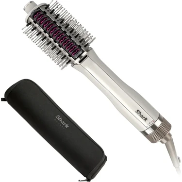
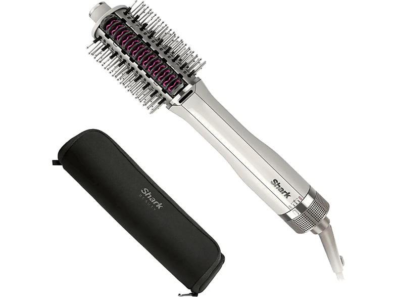
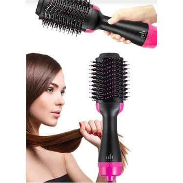
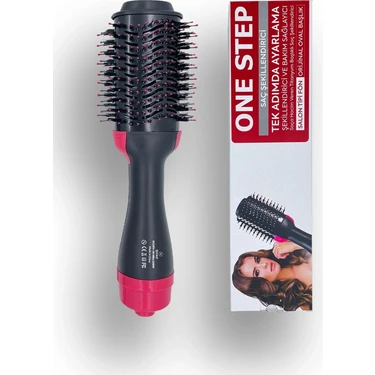
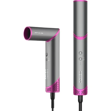
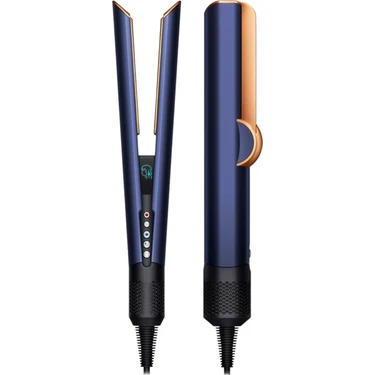
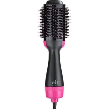
Shark Smoothstyle One Step-Styler Saç Kurutmalı Şekillendirici+Saklama
Benzer Ürünler

Satıcıdan aynı kategoride diğer ürünler
Tümü

Ürün bilgileri
Shark Smoothstyle One Step-Styler Saç Kurutmalı Şekillendirici+Saklama Kutusu SmoothStyle SmoothStyle .smoothstyle-1 { display: flex; flex-direction: column; align-items: center; justify-content: center; width: 100%; padding: 20px; max-width: 1440px; margin: 0 auto; /* Centering with automatic margins */ } .desktop-image, .mobile-image { display: none; /* Initially hide both images */ width: 100%; height: auto; } /* Desktop devices */ @media (min-width: 769px) { .desktop-image { display: block; /* Only show the desktop image on wider screens */ } } /* Mobile devices */ @media (max-width: 768px) { .mobile-image { display: block; /* Only show the mobile image on narrower screens */ } } SmoothStyle .smoothstyle-1 { display: flex; flex-direction: column; align-items: center; justify-content: center; width: 100%; padding: 20px; max-width: 1440px; margin: 0 auto; /* Centering with automatic margins */ } .desktop-image, .mobile-image { display: none; /* Initially hide both images */ width: 100%; height: auto; } /* Desktop devices */ @media (min-width: 769px) { .desktop-image { display: block; /* Only show the desktop image on wider screens */ } } /* Mobile devices */ @media (max-width: 768px) { .mobile-image { display: block; /* Only show the mobile image on narrower screens */ } } Responsive Image Layout .speedstyle-2 { display: flex; /* Use flexbox to arrange images side by side */ justify-content: center; /* Center the content horizontally */ align-items: center; /* Align the content vertically */ padding: 20px; gap: 20px; /* Space between images */ max-width: 1440px; /* Maximum width of the section */ margin: 0 auto; /* Center the section horizontally */ } .speedstyle-2 img { width: 50%; /* Each image takes half of the container width */ height: auto; /* Maintain the aspect ratio of images */ } @media (max-width: 768px) { .speedstyle-2 { flex-direction: column; /* Stack images vertically on small screens */ } .speedstyle-2 img { width: 100%; /* Each image takes full width of the container on small screens */ } } SmoothStyle .smoothstyle-1 { display: flex; flex-direction: column; align-items: center; justify-content: center; width: 100%; padding: 20px; max-width: 1440px; margin: 0 auto; /* Centering with automatic margins */ } .desktop-image, .mobile-image { display: none; /* Initially hide both images */ width: 100%; height: auto; } /* Desktop devices */ @media (min-width: 769px) { .desktop-image { display: block; /* Only show the desktop image on wider screens */ } } /* Mobile devices */ @media (max-width: 768px) { .mobile-image { display: block; /* Only show the mobile image on narrower screens */ } } SmoothStyle .smoothstyle-1 { display: flex; flex-direction: column; align-items: center; justify-content: center; width: 100%; padding: 20px; max-width: 1440px; margin: 0 auto; /* Centering with automatic margins */ } .desktop-image, .mobile-image { display: none; /* Initially hide both images */ width: 100%; height: auto; } /* Desktop devices */ @media (min-width: 769px) { .desktop-image { display: block; /* Only show the desktop image on wider screens */ } } /* Mobile devices */ @media (max-width: 768px) { .mobile-image { display: block; /* Only show the mobile image on narrower screens */ } } SmoothStyle .smoothstyle-1 { display: flex; flex-direction: column; align-items: center; justify-content: center; width: 100%; padding: 20px; max-width: 1440px; margin: 0 auto; /* Centering with automatic margins */ } .desktop-image, .mobile-image { display: none; /* Initially hide both images */ width: 100%; height: auto; } /* Desktop devices */ @media (min-width: 769px) { .desktop-image { display: block; /* Only show the desktop image on wider screens */ } } /* Mobile devices */ @media (max-width: 768px) { .mobile-image { display: block; /* Only show the mobile image on narrower screens */ } } SmoothStyle .smoothstyle-1 { display: flex; flex-direction: column; align-items: center; justify-content: center; width: 100%; padding: 20px; max-width: 1440px; margin: 0 auto; /* Centering with automatic margins */ } .desktop-image, .mobile-image { display: none; /* Initially hide both images */ width: 100%; height: auto; } /* Desktop devices */ @media (min-width: 769px) { .desktop-image { display: block; /* Only show the desktop image on wider screens */ } } /* Mobile devices */ @media (max-width: 768px) { .mobile-image { display: block; /* Only show the mobile image on narrower screens */ } } SpeedStyle Section .speedstyle-5 { width: calc(100% - 40px); max-width: 1440px; margin: 0 auto; text-align: center; box-sizing: border-box; } .carousel { display: none; width: 100%; overflow: hidden; position: relative; max-width: 1440px; } .carousel img { width: 100%; display: block; transition: transform 0.5s ease; } .carousel-controls { display: flex; justify-content: space-between; position: absolute; top: 50%; width: 100%; transform: translateY(-50%); } .carousel-control { background: none; border: none; cursor: pointer; ou
Fiyat Geçmişi
Fiyat Arşivi internetteki fiyatları toplayıp önünüze getirir. Çeşitli satıcılardaki fiyat geçmişlerini görüp en ucuz fiyatları bulmanızı sağlar. Sitede herhangi bir ürün satışı yapılmamaktadır. Her türlü görüş, destek ve önerileriniz içiniletisim@fiyatarsivi.com